

-
I am recreating the poster for the legendary, post-apocalyptic action film starring Karl Urban as the leading character, Judge Dredd. This is one of my favorite movies, a great role model for the Dystopian/Post-Apocalyptic genre.


-
I removed the Iconic X face plate from his helmet in order to keep the most recognizable part of his character highlighted.
-
I then turned the primary image of Dredd into a Silhouette, after I placed the face plate back over his helmet.
-
I then proceeded to add the film's title 'DREDD 3D' and add an additional red X to the background to help distinguish the poster more and to help fans of the comics recognize the character.
-
I should add certain details to my poster such as director, cast, release date etc. this will give my poster a flair of authenticity, helping it stand out as if it were a real poster. Pete Travis directed the movie, which starred Karl Urban as Dredd and Olivia Thirlby as his Rookie side kick.
-
I have included the '3D' subheading for the poster because when the film was released, it was heavily marketed as being best viewed in 3D. This is true, as the camera work, editing and iconic action scenes make it an astounding experience.
-
The original film,created in 1995, starred Sylvester Stallone as the main character. This version was based on the same comic as the 2012 version but had a much larger 'cyber-punk' feel and reminds the audience much of a mix between Robocop and other mid 90's sci-fi films.

-
This version includes codes and conventions of movie posters. This has helped the poster look realistic, as if it has been designed by those who worked on the film itself. I have kept the silhouette of the character as it is imposing and intimidating, even when it is simply white. The X on his helmet helps keep him recognizable.
-
Final Design.
-
I am really happy with how the final design has turned out. I attempted to make it look like a comic book cover, the two movie adaptations seemed to forget the source materials roots as a comic so I tried to correct this. Just from this piece alone, my Photoshop skills have improved. I feel this poster could successfully reach its targeted audience due to the conventions used which appeal to this audience.

-
I drew a quick sketch of what I had in mind for my initial design. As you can see, the design has changed drastically compared to the final piece. This highlights my skill on digital platforms such as Photoshop and my horrid sketching ability.

RESEARCH:

-
The most recognizable part of Dredd's character is the 'X' on his helmet. This helps fans recognize the iconic character. Therefore I have included this in my poster, highlighted on his helmet and also the rough, spray painted X in the background, which suits the genre.
-
Another feature of Dredd's design is his rough lower face. The reader/viewer is never given the chance to see his face, so it is left to the imagination what he really looks like and to the origin of his scars.


.jpg)
-
Legendary actor, Sylvester Stallone, played the role in the 1995 film 'Judge DREDD'. This was monumental for the franchise as it was only a cult-classic comic until this movie. Although it wasn't the greatest adaptation, it laid the foundations for the later 2012 remake.
-
The design of Dredd's mask changed slightly, with the X being removed from the mask, but the core design remained and the rest of the suit remained untouched. This redesign was controversial, as it removed the most iconic part of his design, but that controversy has helped future adaptations not make the same mistake.


-
The 2012 remake turned the franchise into a gritty, post-apocalyptic nightmare which appeased audiences and most importantly, the fans across the globe. At first people were skeptical when they heard a remake was in development, but the redesign of his suit and the return of the X on his mask helped the franchise get back its footing in the sci-fi genre after the failure of the 1995 film. The remake removed the flying vehicles and cyber-punk style of the 1995 film and turned it into a believable future for audiences. Karl Urban helped the character keep his rough image, as he was a perfect pick for the role with his rough lower face, intimidating build and imposing voice.


-
I noticed the silhouette version of my poster slightly resembles the work of Olly Moss. I like how he places scenes of movies inside primary characters. I have attempted to recreate this effect inside the cross, which is best displayed on version 3 of my poster. Although his work is arguably much more artistic, I still think I nailed his style almost perfectly on piece 3 while keeping it within a comic book/graphic novel cover design.

CONVENTIONS:
Cast

Title (In Capitals)
Production
Release
Taglines/Quotes
Mise En Scene

Codes and Conventions are the rules that graphic designers use to create a high quality poster. These include title, cast and production etc.
The original 'Django Unchained' poster has used all of the movie poster conventions. It includes Western Mise-En-Scene worn by the three major characters Django, Calvin and Dr Schultz. Mise-En-Scene includes the weapons which they are holding, two authentic Navy/Army Colt Revolvers which have been used as props in a number of other classic Westerns.
The poster has also included several other key conventions such as the Production (at the bottom) and the cast, primary above the title, secondary below the title.
Also, a tagline or 'quote' has been used at the header. 'The D is Silent, Payback won't be.'. This is a a nod to the origins of the primary character, whose name is Django. Due to his slave backgrounds, some ask him to spell his name, he reminds that 'The D is Silent'.
The poster has replaced the release with the quote 'Coming Soon' which is a common trope within many other movie posters. The poster also includes the director credits 'The new film by Quentin Tarantino' which attempts to highlight his legendary status unlike most other movie posters.
OUTCOMES/ANNOTATIONS:
Version 1:

I am very proud of this design. I feel it meets my initial idea to create a comic book styled poster for the 2012 film 'DREDD'. This was a design previously ignored, both studios that worked on the two film adaptations seem to have forgotten the original source material that is the Judge Dredd comics. I have filled numerous poster conventions, as seen above, and am comfortable with this, non saturated, simple design.
I expanded on the classic stable of the Dredd franchise, the X. I added a simple, spray painted X behind the characters and text which created the effect I wanted. Any fan of the 2012 film or the original comics will recognize this poster immediately.
I pulled the dark red from the X on the helmet and planted it into various areas over the the poster. Most notably the title and the cross in the background. This, once again, gives another sense of familiarity as the red shown is the same color used in every iteration of the Dredd franchise.
Version 2:

This version I am not as fond of, as it is very chaotic and saturated. However, I do feel it has the same appeal, if not more than the first version. This is due to it meeting the same conventions and also the same tone of familiarity.
I have attempted to make this poster seem to represent more of an action style. I was tempted to add in some ambient explosions but I decided that was far too corny. Instead I added various primary characters from the movie as well as Dredd's 'fellow' Judges. This, I feel, is a good idea as it helps the viewer distinguish the main characters silhouette, for people who are not aware of the DREDD franchise may be confused of the hidden character.
I decided to place the main location of the movie, Peach Trees Tower, behind the characters to showcase the location to the viewer. I placed all of these inside of the X, as it looked out of place in front. It has also created a satisfying, overlapping effect with the black space around the X and the title placed in front.
I removed the cross from the helmet and instead added another spray painted cross of which I created in Photoshop. This was done to further play on the punk style. Also if the silhouette is not recognizable due to the removal of the helmet cross, the other judges in the background can replace this sense of familiarity for fans of the franchise to recognize. I like how the Mise En Scene of the character makes it so recognizable to fans, just simply by adding the helmets, this poster can be recognized as being created for the DREDD franchise even without the title.
Version 3:

This is by far the best piece I have worked on so far. I removed the silhouette idea because I felt I hadn't executed it properly. Instead I placed the main character, Dredd, in its place. I also learn't how to clip images inside of other images, so my layering effect inside the X has improved and looks much more professional.
I decided to keep the original conventions in mostly the same places, just a few color changes and movements to help them fit in. I kept the same background cross, this now seems less out of place now that the silhouette has been removed, making this poster instantly recognizable as belonging to the Dredd franchise.
I also made the red more vibrant to assist with making the poster stand out. In version 1 and 2 of the poster the red is more burgundy, now it matches with the red of the helmet more sufficiently.
I also feel that while this poster is almost as saturated/chaotic than version 2, it is also much cleaner and looks more presentable to the human eye. The layout of the poster is also much, much clearer. Layering all of the objects inside of the cross made designing and laying out everything much easier.

I decided to create another poster but for a different film 'Django Unchained'. Instead of creating a movie poster, however, I decided to create a simple bounty poster, detailing his exploits during the Western film directed by Quentin Tarantino. I did this solely in Photoshop and created all of the resources myself. This was only a quick 30 minute project but I still enjoyed creating it and im happy with the outcome.
Mini-Evaluation:
This week was a blast. I enjoyed every moment of the work I managed to complete. I am extremely proud of the posters I have created and for the effort I have put into my work. I definitely picked the correct subject to study.
CRITIQUE FEEDBACK:
Strengths:
I really liked the detail in the annotations and the in depth descriptions of what made each poster good/what you didn’t like about it.
I also liked the many forms of research used, such as the information about the film, and what designers influenced you/what design you liked.
I found the extra information about adobe programs really interesting, I like how you included images and examples.
Another aspect that caught my eye, is the additional poster design for a different film, I liked how it was creative and how you wrote about how you felt you did with your posers/overall work.
Areas For Development:
You could focus on the colour scheme, such as the background and make it more interesting, although I like how it changes colour when you scroll down the page. You could also maybe look into spanning your text out evenly, so you don’t have much space.
Suggested Research:
You could do some additional research into colour scheme or layouts for your website, and what designs makes it appealing/stand out.
Suggested Checklist:
You could also do a couple more sketches to show your initial ideas on paper. Or different fonts/designs for the logo.
Response: I fully agree with the feedback given. I struggled with design sketches due to my poor skills with a pencil, however with extra effort i'm sure I could have made it more in-depth. I should have detailed the color scheme used in DREDD. The red used on the mask was never highlighted, only the X and I did not note the reason for the vivid uses of the color in my final piece. I will, from now on, implement additional research into color usages.


ADOBE PROGRAMS:
PHOTOSHOP: This application in the adobe suite is used for editing of images, such as my redesigns of the 'DREDD' poster. They can be simple touch-ups such as the editing of lighting or changing the color of somebody's makeup. Or, it can be used to create surreal pieces of art, logo's for a company or to digitally remove certain things from images. This app is used by artists, graphic designers and many others all over the media industry. I am currently very confident with this app.


ILLUSTRATOR: This application is featured as a companion application to Photoshop. It is used to create vector graphics, logo's, cartoons, fonts and simple designs that can all be implemented into Photoshop. Much like Photoshop, artisits all over the media industry use this app. I am currently not very confident with this app.


INDESIGN: This application is not a companion app to Photoshop or illustrator. It is used to create flyers, brochures, magazines, newspapers, and books. The app is not as creative as the prior, but has a specific use in creating text lead documents. I am currently not very confident with this app.

TYPOGRAPHY IN PHOTOSHOP:

This is a simple text with color. It has no custom design and is using the BankGothic Sans-Serif font. It is created using the Text Box tool in Photoshop and adding a simple color, in this case orange, using the color box. This is used in every kind of media as it is only a simple text. The simplicity of it allows it to be manipulated in many ways, such as:

This text is slightly edited with the same color and font, the text is warped. I used the direct selection tool to grab parts of the text and warp it, This allows the editor to manipulate a text as if it were a shape, giving the editor the power to change the text into any possible shape. This is used in the industry to create custom fonts and titles.

This text has a slight, black outer glow. This can help the text stand out in same colored back ground, which helps the viewer see the text. It is also essential to use if the text is a main title. Editors will use this when the text needs to stand out among other colors or backgrounds.

This text has a black drop shadow. This creates an illusion that the text is 3D or on top of the background/layer behind it. This also adds a dramatic effect to the text that helps it stand out on a page/screen. It also creates the effect that the text is a light source.

This text has an image of a dog placed inside of it. This helps create the illusion that the text is hollow and has an image/object placed inside. This can be used by editors to objectify the texts, adding more meaning or it can be used to create custom font styles/colors that stands out over other texts.

This text has been placed inside a circle shape to create the circle effect. This is great as it manipulates the circle and transforms it into something much more useful, in this case, the text.
IMPROVEMENTS:


Over the past few days I have learnt a number of new skills which I have decided to implement into a new poster. Here, I took the silhouette idea from my original poster and instead, made it black with a white back ground. However, instead of simply dyeing the figure with the color fill tool I changed the hue to black using the hue/saturation tool. I set the lightness to -100, changing the figure completely black.
In the final image, I took several key design features from my other posters and mashed them all together, instead with well cut, HD images I downloaded properly from the internet instead of a simple copy paste. I used the feather tool on the rubber to lightly cut the edges of the images, making them fit well into the collage. I changed the background back to black and gave the silhouette a red outer glow, giving the illusion that the silhouette is spray painted.
Here, I have updated the design above with a 3D title, due to the movie being largly advertised in 3D, which is also a part of the title. I took the original title and extruded it from the layer into a new 3D layer, I then directed the title to the bottom left of the screen slightly to give the effect shown. After this I directed the 3D lighting towards the title as to highlight it from the rest of the poster, making it easier to see and for it to further stand out.
POSTER COMPARISON:
VERSION 1:

My original variation is clean, clear, and has no clutter on the screen. It features the base silhouette of the figure seen in the original movie poster and includes various conventions such as cast, production, title, tagline, mise-en-scene and release.
I like this poster because it is simple, yet still manages to convey the key aspects of the film to the viewer through the spray-painted X and the imposing figure of the silhouette. Although it is not my favorite, I still feel it is a great design which almost mirrors a production-level poster.
VERSION 2:

My second version is by far my favorite, as it is what I imagine the possible future sequal to the first movie will look like. It is much more complex than the first, as I used clipping techniques to place the secondary images inside of the red X seen in the first version. It uses a different figure which is not transformed into a silhouette, which complements the actors spot on representation as the classic comic book character.
This version contains much, much more Mise-En-Scene than the first, which helps the viewer with identifying the movies genre and key concepts before seeing the trailer.
VERSION 3:

This version, while not my favorite, is definitely the highest quality poster compared to the others. It contains ideas from all of my past poster designs and mixes them together in a satisfying way for the viewer. I also included design inspiration from the poster for the Dredd film in the 90's. It is the most alike to Olly Mosses work compared to the others, and reminds me of a classic star wars poster.
The quality, in my opinion, is top tier and I think it looks production level. It actually took less time to complete than my other posters due to knowledge accrued over the week.
RE-BRAND PROJECT:
BRIEF:
During this project, I am tasked with creating marketing for my own brand. I will research key marketing techniques within the industry, evaluate other marketing campaigns, and ultimately come up with a creative and persuasively realistic brand idea and brand logo. I should use my knowledge in key media conventions to create an eye catching logo for my brand which will stand out among other designs. I should also make my brand unique, separating it from the saturated market, ultimately creating a unique brand identity.
Brands surround us in everyday life. They cater to our specific tastes, price range, styles and our desires. They cater to a specific target audience and profit. Brands are clothing, brands are food items, brands are car manufacturers. Luxury or not, a brand is always unique in design and audience.
IDEA 1:
My first idea is NOBLE clothing. This is a sports clothing line which focuses primarily on comfortable clothing which is stylish yet affordable. The clothing is designed to assist the athlete and help reach peak efficiency while also being comfortable enough to be worn as indoor clothing. Primary competitors are sports brands like Nike or Luxury brands such as Supreme. The brand mocks expensive names, making sure that the clothing is worth the buying price through comfortable yet efficient materials at a low asking price.
IDEA 2:
My second idea is GO! An energy drink for those with tight time schedules who are also aware of their health. This brand strives to create an effective energy drink with natural, honest materials found in nature. The flavors will be natural fruits which lack the toxic taste of most energy drinks which saturate the market like Redbull or Monster.
IDEA 3:
My third idea is an electric car brand called NEO ELECTRIC MOTORS. This brand creates electric variants of desired vehicles which would not be seen as electric such as rare, high-end vehicles like Mustang or Nissan. This company will look to create desired vehicles which are healthy for our environment, with the ultimate goal of helping to create a safe yet stylish future. The manufacturer will work much like Abarth, but instead of creating expensive versions of already existing vehicles, NEO creates cheaper, environmentally friendly variants.
RESEARCH:
My primary goal is to create eye-catching branding designs which are simple, memorable and timeless. These conventions are all used in big, global brands like Coca-Cola or Ford. I will accomplish this through primary research on branding and advertisement strategies used by these big companies such as the effective use of social media or marketing designed to catch the eye of viewers and direct attention towards the brand. The design must effectively relay the purpose of the brand in a short glimpse, such as the Fed-Ex logo, which contains an arrow between the E and X, which relays the idea of fast and direct deliveries.

Primary research is data collected for the first time, such as through interviews, investigations or analytics.
Secondary research is the collection of data from primary sources, such as watching interviews or reading articles.
PRIMARY RESEARCH/ADVERT ANALYSIS OF COMPETITORS:

This Coca-Cola advert is appealing because it contains an eye-catching location in its design and because of it's memorable catch phrase which promotes positive
thinking. This representation of positivity helps create a good image for the brand, which also has a heavy focus in the advert with its memorable logo.

Instead of the brand being the primary focus in this advert, the primary focus is an inspirational quote. The text is in yellow with a dark background, this helps it stand out, being difficult not to be seen due to the high contrast between the two colors.

This advertisement from Ford places one of their cars into an unrealistic experience, doing a task it most likely couldn't do, but this optimism helps relay the reliable image of the brand onto the viewer, persuading them that the vehicle for the job, is a Ford.
SECONDARY RESEARCH/BEST BRAND LOGO'S:
In order for a brand to be recognized it needs to have a good logo to help distinguish it from other designs. I have analysed a list of some of the most recognized brand logos of all time.


1) Starbucks is recognized as one of the most memorable logo's within the modern generation. The logo is complex enough to stand out on the high street.
2) McDonald's is so widespread that it is easily the largest global brands. People from every generation recognize the iconic yellow M.
3) Apple is the worlds leading brand in mobile devices, software and hardware. It's logo is a clear resemblance of its name, this helps it's customers easily recognize the brand.


4) FedEx is renown for its legendary logo design, which includes a hidden but easily noticed arrow between its E and X. The simple complexity of this logo has awarded it the best design in the industry and is one of my personal favorites.
5) The Micky Mouse logo for Disney is the most famous logo of all time within the entertainment industry. It is widely recognized by the younger community and their parents.
NIKE/SUPREME RESEARCH:
The plan for my brand is to brake the current trend in society. Brands like Supreme caught traction primarily through social media, the brand is highly criticized for being an expensive name with little style (Its best clothing being collaborations with other brands such as Nike). On the other hand, Nike is highly recognized as being a reliable sports brand and is extremely popular all across the globe with most generations. I want my brand to be a blend of both, being highly stylistic with reliable materials, earning its price tag instead of being worn for the soul reason that its needlessly expensive (Supreme). I am going to aim my marketing towards social media, much like Supreme. Supreme sponsors 'Influencers' to hype up their brand to their audience. This has created an expensive image for the brand on social media, while most of its designs are very simple.


NOBLE PLAN/IDEA'S:
I have decided to go with the name 'NOBLE' for my clothing brand because the word is largely associated with two vastly separate things. One way of seeing the word is through strength, or remaining Noble in the face of danger. Whilst it can also refer to the medieval era, with the selfish/rich nobility. So this double meaning juxtaposition, I feel, helps with the idea of merging Nike and Supreme styles and target audiences together. The word 'Noble' can also be associated with superiority, which I am using as a parody of 'Supreme'
INSPIRATION:

I really like this design for the Adidas tracksuit. Adidas is one of my choice clothing brands when it comes to quality and comfort. I also prefer the style over larger brands such as Nike.
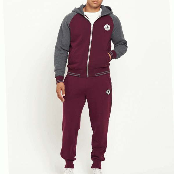
I really like this Converse tracksuit design. Converse is my number 1 favorite shoe brand, but I also really like their Tracksuits. This tracksuit also features my choice color, Burgundy, which I would like to use for my design/marketing.
I plan to use these tracksuit designs as a basis, or just simple inspiration for my own. I will not completely rip off the design, only use slightly similar layout and color scheme. The logo will be self made and fit in with the design, much like these designs.
ANNOTATION PRACTICE:

This piece, by Abram Games, is extremely patriotic as it mimics wartime British propaganda created during the first world war. It makes use of a red-blue color gradient that repeats in the below text. The gradient colors are heavily contrasting, which stand out to a viewers eye and could also represent the two sides of the first world war.

Created by David Carson, this magazine cover is surreal in its chaotic complexity. It reminds the viewer of messages serial killers would typically leave behind during the 80's. The confusing cover is being used to draw in the eye compared to other organised covers, this helps it easily gain the attention of the viewer and keep the attention through the unexplained mystery of the cover.

An overtly stylistic piece by Milton Glaser. The piece has an easily recognizable 60's - 80's vibe while also seeming to have a sought of stained glass window style. The chaotically arranged colors of the poster contrast the silhouette of the man viewing the piece. This is a smart way of mirroring what the viewer can see, possibly calling those who view this piece boring or dull like the dark silhouette.

This magazine cover, by Hattie Stewart, has an intense sticker bomb style which stands out to the eye of the viewer. This is effective because it is a magazine, it will need to stand out in the saturated industry. The skill of contrast is again used in this piece to single out the figure from the rest of the work.

This movie poster by Saul Bass is simple and easily recognizable by the viewer while also having a tribal/African sought of style, which is a huge part of the story. The poster's simplicity will help it gain recognition from viewers, where it is easier to see and remember than most other movie posters.

This highly complex piece by Tad Carpenter is very expressive and has a feel-good cartoonish vibe. While it is complex, it is also easy on the eyes with its Vibrant colors which are spread out all over the piece.

This piece, by Sara Andreasson, shows two personal space breaking women posing. The colors are intentionally vibrant on the women compared to the man. They greatly juxtapose each other.

This well organised piece by Jonathan Barnbrook features complementing colors which well suite the aesthetics of the piece. The poster features the main conventions of a poster while not easily explaining what it is for, which is a smart way of getting a viewers attention.
BIBLIOGRAPHY PRACTICE:
Here, I have learn't how to use Harvard Referencing to appropriately avoid plagiarism. I have created referencing for both a book I found in the library and also a web-page for a recent news article. We need to reference in order for the people who created the original source of information you sourced to be credited as to avoid plagiarism.

LOGO DEVELOPMENTS:


Here are my early photo developments. I sketched these in my notepad using a pencil, you can see how my final design evolved from these sketches.

I started with creating a serif N. This proved quite tenuous as I had little experience with Illustrator and didn't know how to create custom fonts, so I ended up drawing the N.

In this version I skewered the N with an arrow, combining the high class imagery of the Serif N with the imagery of speed connected with arrows.

In this updated version I added the rest of the title as well as an indicating title telling the viewer of the brand. I removed the skewered arrow and replaced it with a more sleek looking arrow, which is connected to the Serif tail of the N. I used the pre-made shapes in illustrator to create the arrow.

This complex variation has an additional diamond in the foreground, behind the text. I also added a silhouette of an athlete connected to the arrow, further mixing the high class and rapid symbolism. I used the polygon shape tool to create the diamond.
1)
2)
3)
4)

This variant is extremely similar to number 4, except the diamond fades along the arrow line.

Here, I created an Illustration for one of the staple characters from the game Borderlands.
5)
CMYK/RGB:
Cyan Magenta Yellow Key (Black): This color mode is for printed illustrations. The colors get darker as you mix more together.
Red Green Blue: This color mode is used for digital illustrations or just simply color on a computer display.
I converted my final design into a smoother gold without a gradient to get a better reading on the color modes.

My Thoughts:
I am proud of the outcome of my final logo design. It is just as I envisioned and planned to look. It makes use of all of the conventions I set for it such as its mix between luxury brand and sports brand styles.
Creating the serif font for the N was complex and frustrating at first but after I gained further knowledge in the Illustrator program, it was much easier.
I posted the 3 designs on my Instagram and most preferred the gold version over the blue and blank versions.
I have associated the golden color to my brand to reflect the luxury style of the brand, while the arrow and the runner contrast the serif text they are connected to.

MY FINAL LOGO DESIGN:
COLOUR THEORY:

Colour theory helps designers understand the core concepts of colour and how to use them appropriately/effectively.
Primary Colours: Red Blue Yellow.
Secondary Colours: Orange Purple Green.
Tertiary Colours: Colours further mixed together.
Complimentary/Contrasting: Colours on opposite ends of the colour wheel.
Monochromatic: Different variations of a single colour.
Hue: Another word for colour.
Saturation: The intensity of a colour.
Value: The darkness/Lightness of a colour.
Analogous: Colours next to each other on the colour wheel.
Split Complementary/Triadic: Different complimenting colours mixed together.
Tetradic: 4 Colours mixed together.

Analogous

Contrasting

Fade/Gradient/Monochromatic:
BRAND COLORS:
There are 3 colors I want associated with my clothing brand. These colors will symbolize the meanings of the brand and represent it's luxury style.
Gold is the first color I have chosen. This represents the prestigious name of my brand and is also a symbol of the quality I wish to be represented. The gold also has a shine/metal effect, if it was printed the logo would shine/reflect like real gold.
Blue is a great color as it is easy on the eyes while it also stands out fairly well. It also helps with the high quality view as a long time ago, blue paint was the most expensive and the most desired color. The color works well with a fade effect as it gives a nice matching effect with the arrow as it runs along the fade.
Burgundy, I feel, compliments gold perfectly and gives a warm, welcoming effect on the eyes. It also gives the user more options, contrasting the blue. It fits well with a gold outline which also helps the logo further stand out.


BRAND ADVERTISING:
I aim to create an advertisement banner/billboard that fills my logo conventions and reminds the viewer of my final logo/brand.
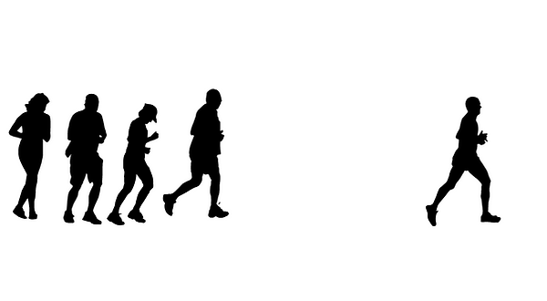
I started with 5 silhouette's of joggers/runners, resembling the silhouette on my logo. I placed one ahead of the group as a sort of front runner, the man wearing my brand.

I then added an arrow skewering the silhouettes as well as two pieces of text on either side of the arrow line.

This version contains the gold plated effect in the back ground to carry along that sense of nobility I want my brand to carry. With this I also added text at the bottom of the advertisement 'run with Noble' but the word noble being a simplified version of my logo.
EXCELLENT/BAD ADVERTISING EXAMPLES:
Brands need advertisements to help increase their target audience and possibly reach out to entire new audience groups. Advertisements are crucial in a brands survival and growth. If a brand makes a mistake in their marketing, their brand image could be negatively effected and their audience could shrink.


These are great as it gets the viewer involved with the brand, searching for your name on the product gives you a reason to buy it other than wanting a coke.
This advertisement, while questionable, is excellent as it stands out to a viewer, after viewing it is sure to draw out some laughs. Today, this would be a great advertising method as a billboard like this would be shared all other social media, spreading the brands influence over the most populated place in the world, the internet.

This advert is not so great as, while it includes some comic relief, it also gives the brand a poor image for educational purposes and could also put some centers off from buying their product. Although it would be very popular among students and social media.

This advert is extremely inappropriate as it is inadvertently (possibly intentionally) racist. It includes a # which means it has a reach into social media, which would not help its brand image, although it will get people talking about the brand, none of the talk would be positive.
BRAND IDENTITY/IDENTITY PRISM:
Brand identity is the key features of a brand such as color, design, logo, font, target audience etc. This gives a brand its own feel and will help with its marketing/advertisements. A good example is Nike, as it has created its own identity with its iconic 'Tick' logo and its quote 'Just Do It'. These features help people recognize the brand outside of general advertising and it also helps create an appeal towards its brand from its target audience (in this case, athletes).

This is a brand identity prism. It helps us identify a brands identity and how they conduct their marketing.

PARTNER BRAND PROJECT:
During this project, I was tasked with creating an advertisement based from a partners brand work. For this I created a poster for a boxing brand 'Round 2' made by my partner Chayse.

This is the 'Round 2' logo created by my partner, Chayse. I felt it was an extremely good logo to work with and I enjoyed developing it into an add.

As requested, I developed the logo and added scenes of famous fighters merged into the logo, which I thought turned out great along with the other variants.
I then created a poster using the resources emailed to me from a zipped file from Chayse. I like the old boxing poster vibe that it has, it also slightly looks like an old WWII recruitment poster which was not my goal but a cool turn out.


I used a mock-up to make the poster seem as if it has been placed onto a subway/underground advertisement poster for my partner's brand. I added a title for his brands logo name, a tagline 'Beat the Best' and a small description for his brand below the logo '
first choice in combat sport fightwear'. I am proud of how this logo looks and how it has a sought of professional style in how it has been created.


CHECKLIST:
A small checklist of work I am yet to complete at the end of my project.

My survey.

From this survey I discovered the preferences of my designs which has helped me design my logo and brand since this survey. I found out that majority of people prefer style and designer focused brands over comfy, practical sports clothing, which was a surprise.
The survey told me that people prefer vibrant colors over dark colors, this matches with the prior statistics as most designer clothing is vibrant.
I am pleased with the varying answers for the preferred brand question. It showed a mix of sports and designer brands which I was hoping for as well as other well known high-street brands I didn't expect to see.
The social media questions were interesting as both see their brands advertised 100%. this shows that, for our generation, social media is one of the most important advertising platforms out their.


MY GUIDELINES:


Brand Identity Prisms:
We watched a Christmas advertisement for McDonald's and created a brand identity prism for it, this is the outcome. The advertisement included social media (#) and showed a caring, child friendly personality which would appeal to its target audience easily.
We watched another advert for Dove, which promoted feminism in a positive and liberating way, this will strongly appeal to their target audience and also help improve their image of female beauty products.
EVALUATIONS:
At the start of this project, I was fairly adept at using Adobe Photoshop as I was taught how to use it during my GCSE media and art, although I was mostly self taught. I did not know any other Adobe program.
I have learnt how to use other programs confidently such as Adobe Illustrator and Adobe In-design. I did not know how to use these programs before the start of the project, as I do now. My favorite design program to use is certainly still Photoshop, it is the program I am most experienced in. Although I do enjoy using Illustrator. My favorite design activity in this project was definitively the Brand Design work. I enjoyed creating the logo for my own brand and creating the designs for my partner.
The secondary research I used for the competitor Brands was interesting as it gave me further insight into the larger brands such as Nike. The most useful source was Nike, as it gave me further insight into how clothing brands are advertised to the general public and how they try to please all customers demographics. I prefer secondary research as it is easier to conduct.
Learning other programs was certainly important in influencing my work as it was much easier to design a logo on Illustrator than it was on Photoshop. I feel my most successful project is my Logo project as I had most fun whilst designing it and I didn't have much help designing it. My weakest program is definitely In-Design as I had not had much practice with an app like it prior to joining this course.
The most useful skill I have learnt is my Illustrator work as it helped me completely design a logo from scratch.
I would like to learn more about In-Design, as i'm still not confident with using it.
I really enjoy and feel very confident with designing content for the more creative side of the graphic design industry.
I feel I have completed this project to the best of my ability.
HALLOWEEN DESIGN TASK:
This task is just a little final project for our Fundamentals Of Design course.


With this piece, I created a digital illustration of a classic zombie design, from an image of a zombie from the walking dead. I used the same process as the borderlands psycho mask piece which is extremely simple but has its own appealing style.

This is a recreation of The Cabin In The Woods poster, Since the film is more of a comedy than a horror, I set out to create a scarier/gloomier poster than the original. I have also added additional conventions to the poster such as cast and production etc.

Bus-stop Mockup:
